Research has shown that up to 90% of decision-making about products or services can be based on colour alone, so choosing the right colour palette is crucial – which means designers need to keep abreast of the top contemporary colour trends, whether they use them or not.
Today, brands are going further than just using the right colour in a logo or product to be on trend. From fashion to food and furnishings, colour is being used to entice, excite, inspire and engage consumers.
Below is a summary from Creative Market on some of the key colour trends for 2016, together with the insights driving these palettes.
Pastels
Dreamy, milky and soft, pastels aren’t just for nursery rooms anymore. Pastels have grown up and become sophisticated. Pantone’s colours of the year, Rose Quartz and Serenity, have already made their way into advertising for banking, cosmetics and tech. Spotify’s beautiful ‘Year in Music’ uses a pastel palette that expands into yellows, orchid and peach.
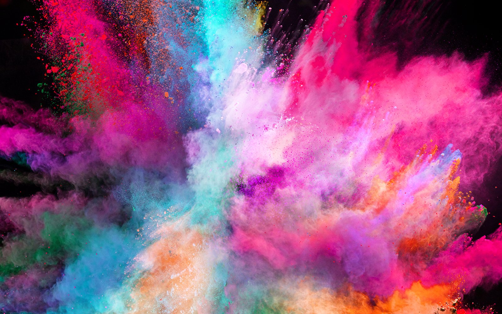
Vibrant, bold colours
Bright, punchy and bold colours that fit in with the 80s/90s retro trend. Retro-inspired palettes with popping bright colours bring a lot of energy to your creative project. This fun palette draws inspiration from the Memphis Group, and their postmodern, rebellious, playful and asymmetrical designs. Retro is youthfully remixed with splashes of acid bright colours colliding with muddier colours and romantic pastels. Take a look at the painter Sonia Delaunay’s work to find inspiration in fearless colour combinations!
Blues
Blue will continue to be a trending colour in 2016. Ocean blues reflect a relaxing palette and our connection to nature. This year International Klein Blue (IKB) is on the rise too. IKB is a rich blue hue mixed by the French artist Yves Klein – perfect for intense accents. Underwater patterns and shadows come into play, as well as tiles, denim, and batik.
Monochromatic or limited
Limited colour palettes stand the test of time. Simple, minimal and elegant colour schemes where all the colours come from a single hue. Or combining black, white and grey. These colour palettes are timeless and powerful because they help create focus in a visually oversaturated environment.
Opulent indoors
In the home decor market we’ll find dark, deep walls contrasted with accents that glimmer with decadent metal. Think of heirlooms, intricate, and detailed craftsmanship; think steampunk, velvet, marble and pink copper. As we accelerate into the future, we look for reassurance from the past. A contemporary twist on our heritage, this is maximalism. In graphic design we can see this trend in rich Art Deco and gold foil treatments, it’ll be interesting to see if this trend expands. It makes a huge contrast to the minimalist trends.
Outer space
Dark blues and teals, juxtaposed with electric pinks, corals and reds, reflect our space explorations. Be inspired by space, swirling nebulas, science fiction and David Bowie. Take a look at the 2015 Valentino couture collection, with constellations and planets in motion – futuristic, celestial dreams with impressions of weightlessness, and pops of electric neon colours.
https://creativemarket.com/blog/2016/02/29/6-beautiful-color-trends-of-2016
